
In an effort to cater more toward resident needs and preferences, today’s senior living communities are evolving to feel increasingly like upscale hotels rather than bland medical environments. They’re shifting away from a one-size-fits-all approach to meeting the residents where they are, with an emphasis on luxury. Color is a key component when designing these spaces, blending cozy and luxury as the community is more than a hotel but a home. Yet there are many nuances when selecting color for senior living, including functionality, accessibility and mood enhancement, and the needs of residents are always at the forefront of our minds throughout the design process.
Understanding the Needs of Seniors
Aging is part of our natural life cycle, and with age comes varying health implications. Mobility can be a challenge with multiple surgeries or diagnoses. Vision can deteriorate, making objects blurry or colors tough to distinguish between. Memory is not always what it used to be, especially with dementia. We design spaces to meet each of these needs and more, and color plays a critical role in many of the decisions we must make.
Practical Considerations in Color Selection
Safety is paramount in senior living, and color selection can mean the difference between helping or hindering someone experiencing mobility impairments. Our goal is to help seniors move about safely, reducing, wherever possible, the risk of falls. We use color in wayfinding and spatial awareness, highlighting safe pathways containing contrasting hues for seamless orientation.
Color in signage can also accommodate vision loss. Typography and symbols will already be large, but we must further pay attention to color contrast for those unable to distinguish colors as easily. The color may appear differently on some finishes compared to others. Likewise, we keep this in mind when selecting furnishings, ensuring they have a contrasting look to the floor for residents to navigate spaces with ease.


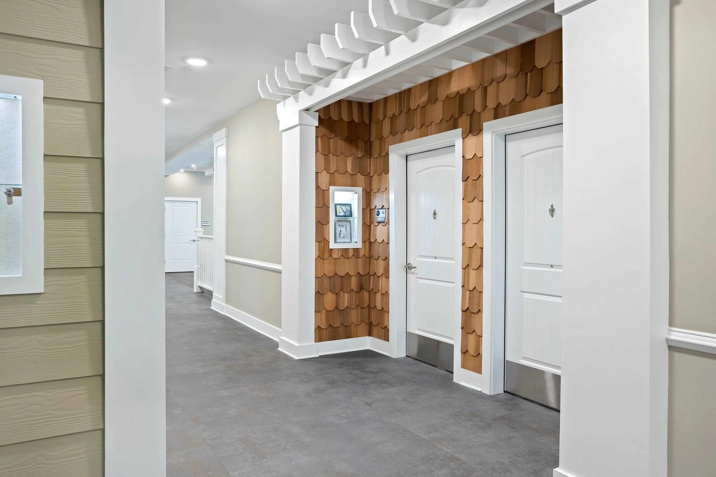
The Claiborne at Brickyard Crossing is a great illustration of our practical applications. Patcraft’s Metal Collective luxury vinyl flooring resembles concrete and maintains a 5mm thickness to minimize transitions between spaces, assisting with ease of mobility for residents using walkers/wheelchairs. The gray streetscape-style walking path guides residents through the space to storefront-style amenities named after local landmarks. The earthy Cedar Valley cedar plank shingles transform entries to look like residential exteriors, further assisting with wayfinding for dementia residents.
Another example is Fleet Landing, in which we specified custom wall sconces from Top Brass with signage, as well as name plates and custom metal pendants. These finishing touches achieved the elevated aesthetic found throughout the community while accommodating vision challenges with lighting to highlight the contrast between black and yellow.
Psychological Effects of Color
Have you ever heard the sayings regarding how a fresh coat of paint can do wonders or transform a space? Those aren’t just sayings; they’re true! They apply to revamps in furniture, flooring and fixtures too. Color coordination can make a space feel larger or smaller, brighter or darker, and these feelings can influence our mood.
Mood can affect overall well-being, especially for those experiencing dementia symptoms. We work to select palettes that will promote relaxation and calmness and stimulate memory. Blues and greens evoke a sense of restfulness and attachment to nature, whereas grays (often assumed to be a popular neutral color for senior living) can lead to higher levels of frustration, ambivalence and anxiety. Reds are tricky because they can promote stimulation but also have negative effects, making them ideal for exercise rooms or areas of activity, according to A Place for Mom. This correlation between color and mood guides us in our designs.


In The Claiborne at Brickyard Crossing, we specified a custom-printed carpet from Shaw that infuses saturated color into the dining space while unifying the color palette with the perfect combination of cool blue tones and warm rust accents. The high ceilings, plus muted wall and column colors, mixed with the patterned carpet, help open the dining space.
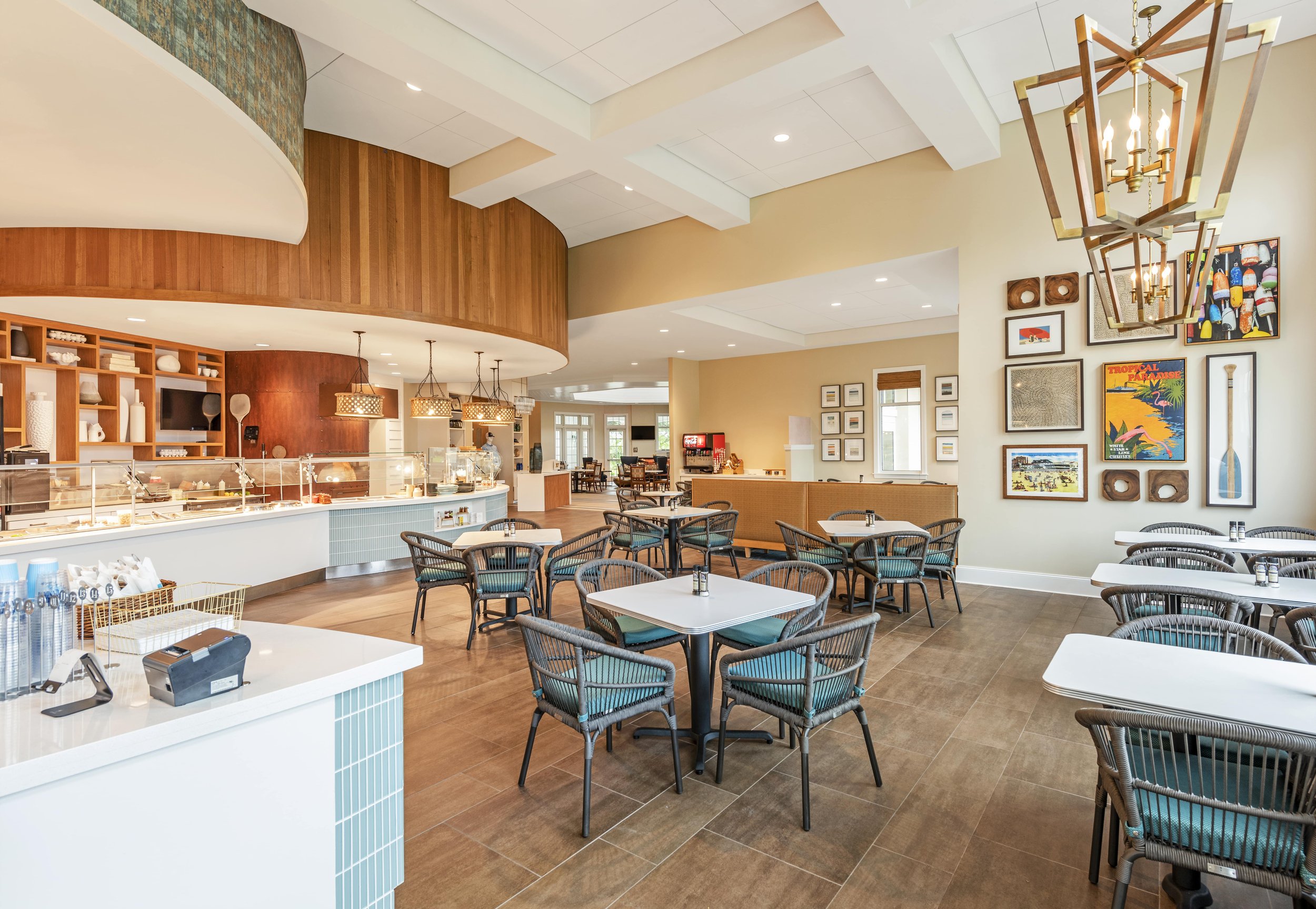
Fleet Landing’s new Main Street building was designed to be the community’s premier dining destination with a unique walkable “Main Street” experience. The combined distinct colors and furnishings offer a lively hospitality aesthetic rather than a dull cafeteria environment.
Beyond Color
As senior living communities evolve to embrace notes of luxury mixed with the comforts of home, color emerges as a key component in creating environments that promote well-being, safety and excellence. We've seen how color can address physical and psychological challenges, from aiding in wayfinding and enhancing visibility to stimulating emotion and facilitating memory recognition. Through thoughtful selection and application, we can craft life-enriching experiences for seniors.